A golf club can have a well-designed flexible membership product, sensible pricing and a clear commercial purpose, yet still struggle to generate the right level of enquiries.
Often, the problem is not the product itself. It is the way the product is explained online.
This is where many clubs come unstuck. Traditional membership categories are generally easier for golfers to understand. A seven-day membership or a five-day category is familiar. People broadly know what they are looking at. Flexible membership is different. It usually involves credits, usage rules, eligibility details and a slightly different way of thinking about value.
If the website messaging is vague, cluttered or overcomplicated, prospective golfers quickly lose confidence.
And when that happens, they do not enquire.
Flexible membership is not harder to sell because it is weaker. It is harder to sell because it requires better explanation.
A traditional membership page can often get away with listing the annual fee, a few member benefits and a join button. A flexible membership page cannot rely on that. The golfer needs to understand how it works, who it is for, and whether it suits the way they play.
That means clubs need to be much clearer online.
Too many websites assume the visitor will “figure it out” once they read enough. In reality, most golfers make a decision much faster than that. They are scanning for clarity. They want to know whether this is relevant to them, whether it offers value, and whether it feels simple enough to trust.
If the page creates friction, confusion or too many unanswered questions, the enquiry is lost before the club even knows it existed.
When somebody lands on a flexible membership page, they are usually trying to answer a small number of practical questions.
Not eventually. Quickly.
They want to know:
What is flexible membership?: Give them a plain-English answer immediately. Avoid jargon. Explain that it is a more flexible way to belong to a golf club, designed for golfers who want membership benefits without the same level of commitment as a traditional category.
Who is it for?: This matters more than many clubs realise. If the page does not help the golfer identify themselves, they are less likely to continue. Spell out the audience. Is it suited to occasional golfers, time-poor golfers, returning golfers, or those who cannot justify full membership right now?
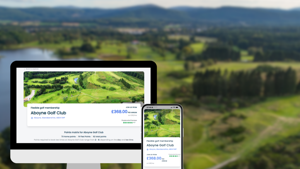
How much does it cost?: Do not hide the price and expect people to enquire first. A lack of pricing can create suspicion. You do not need to overload the page with every possible detail, but the cost and the value exchange should be clear.
How do the credits work?: This is one of the biggest sticking points. If the golfer cannot quickly understand what they receive and how those credits are used, they will often assume the system is more complicated than it really is.
What do I actually get?: List the benefits clearly. Can they obtain a handicap? Can they book through the app? Are they part of the club? Are there restrictions on competitions, guests or booking access? The more relevant the questions, the more important it is to answer them on-page.
Am I eligible?: If there are geographic rules, age rules, upgrade pathways or member category limitations, make them clear. Confusion around eligibility often leads to poor-quality enquiries or frustrated conversations later.
This is where many flexible membership pages lose people.
The mistake is not that clubs include too much detail. It is that they explain it in the wrong order.
Start with the simple version first.
For example:
You join the club on a flexible basis and receive a set number of credits to use when you play. The number of credits used depends on when you play. Quieter tee times typically require fewer credits than peak times.
That is much easier to process than a long block of text, a dense pricing table and three footnotes underneath.
Once the core idea is understood, then you can add supporting detail.
A good rule is this: explain the principle first, then the mechanics.
To keep it simple:
Use examples: Show what a typical round might look like in practice. Give one or two realistic examples of credit usage. Golfers do not just want rules. They want to picture themselves using the membership.
Break up the information visually: Use short sections, icons, tables or accordion FAQs. Large blocks of text make flexible products feel more complex than they are.
Avoid internal language: Clubs often use wording that makes sense internally but not to a prospective golfer. Terms such as “category access”, “points matrix” or “utilisation banding” may be commercially accurate, but they are not helpful at first-touch website level.
Be upfront about restrictions: If there are usage windows, exclusions or limitations, say so clearly. Done properly, this builds trust rather than harming conversion. The wrong golfer self-selects out, while the right golfer feels more confident about enquiring.
A strong page should not just describe the product. It should guide the golfer towards action.
At a minimum, it should include:
A clear headline: The first line should explain the offer in a way that makes sense to somebody seeing it for the first time.
A simple summary near the top: Before the golfer scrolls too far, they should understand what the category is, who it is for and why it may suit them.
Transparent pricing: Not necessarily every possible permutation, but enough for the golfer to understand the commitment and likely value.
A plain-English explanation of credits and usage: This should feel easy to follow, not like reading terms and conditions.
Key Benefits: Show what the golfer gains beyond rounds of golf. That may include belonging to the club, booking convenience, handicap access, community, or other member privileges.
Eligibility details: Reduce wasted enquiries by making the basics clear.
FAQs: A flexible product usually creates more questions than a traditional category. A good FAQ section helps handle that without making the main page feel cluttered.
A strong call to action: Do not leave the page hanging. Give the golfer a clear next step, whether that is enquiring, booking a call, downloading more information or starting an application.
Live direct booking is often a major advantage for flexible membership because it removes friction for both the golfer and the club. It allows the customer to see availability and book instantly, which gives them confidence and suits the way many people want to play today, especially when booking last minute.
A concierge service may feel like a more personal or premium touch, but it can slow the process down and leave the golfer waiting for confirmation rather than taking action there and then. It also relies on someone at the club being available to manage those requests, which adds admin and can create inconsistency. For many modern golfers, the ability to book directly is not a nice extra. It is an important part of the product experience.
When a flexible membership page is unclear, the cost is not just fewer enquiries. It is fewer qualified enquiries.
Golfers who might be a good fit leave the page because the offer feels confusing. Others enquire without properly understanding the model, which creates more back-and-forth for the team and lower-quality conversations. In both cases, the website is weakening conversion before the sales process even begins.
Over time, that means clubs can end up with a strong product that underperforms simply because the messaging is doing a poor job of selling it.
That is a frustrating place to be, especially when the demand is there.
Flexible membership is often built to reflect modern golfing habits more accurately. But if the website does not explain it clearly, the product can still feel difficult, uncertain or overly complicated to the very golfers it is designed for.
The best flexible membership pages do not try to say everything at once. They answer the right questions, in the right order, with the right level of clarity. And that is often the difference between interest and enquiry.